Shiny new Controls/UI
OpenClonk now has updated Controls and a new UI! The aim of these changes is to provide comfortable and easy access to everything, while maintaining speed. For that reason nearly every action has multiple controls now. But I’m getting ahead of myself, take a look for yourself!
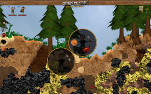
Behold, the new UI:
The New
As you’ll probably have noticed, most of the UI is gone. So is the Backpack! It got replaced by a general inventory, displayed at the left side. With a unified inventory, the separation of hands and items in the backpack also is gone. You simply select which inventory-slot should be in your left/right hand.
The content-menu now also features fellow Crewmembers. That means you can trade items with your own clonks directly!
The health- and breath-tube have been removed completely. So have the two hand-fields.
The Old
The actionbar at the bottom, used for interacting with structures and vehicles, stays the same. However it has a fixed order now, as opposed to sorting the selected object to the beginning.
The crew-selector also stayed the same, and doubles as the only health and breath-information now. Some fancy features are planned though.
The Keys
About everything is doable by clicking on stuff, but as mentioned above, quite a few new keys have been added for the Pros.
- The Hotkeys 1-9 select the corresponding slot into the left hand now. Holding a hotkey + Mouseclick also selects the slot into the corresponding hand.
- Shift is the Inventory-key now. Shift + Mouseclick throws the corresponding hand-item, Shift + Number drops the corresponding slot.
- Ctrl is the Crew-key. Ctrl + Number quickly selects the corresponding crew member.
- Space is the Interaction-key. Space + Number interacts with the corresponding Actionbar-Item. Releasing Space without pressing a number interacts with the first one.
- Also, so far the Q-Key doesn’t have a function now. But I’m sure we’ll find something for that. 😉
The Plan
Quite a few more features are planned. Many things will be implemented as experimental solutions. We will see how many survive. 🙂
A Toolbar to the right, for using Tools in your inventory directly. (Construction menu, chopping trees, etc.)
Indicator for usable stuff.
A Keyboard-Layout for left-handed players.
A way to select the right-hand item comfortably.
…and many more
A complete overview over the current iteration can be found here: https://wiki.openclonk.org/w/Controls


Why is this not published?
Because I wanted to get some changes done before taking the screenshot for it. 😉
Nice.
Not the inventory/item system… just while looking at that blank wood header (and the flying stuff at the right border) in the image u posted: I’ve nothing against itself but it could content more. What about moving the amount of money in it, a Menu Button (Esc), goal into the menu or header wood and the “back to the rocks” is also flying like somewhat. Could be better designed.
Did you forget that a clonk has 2 hands? With the hotkeys 1-9 you can only select an item for the left hand. Where’s the hotkey to say “put it into his RIGHT HAND” without using the mouse?
I like how this turned out. But in my opinion, the inventory slots are displayed far too small. (Should be the same size as the items in the menu) Also, with the backpack gone now, I think we should limit the clonk’s inventory to 5 – nice round number. I only increased the clonk’s inventory to 7 back then because 2 would be in the hand and 5 in the backpack.
Also, Banana Time!
Agreed
I prefer large inventory to small inventory, because small inventory forces you to switch tools all the time. There’s usually no good place to put the tools, so you have to throw them away and then search the right tools in a huge pile of objects.
Love all the feedback!
To answer some questions:
The huge wooden thingie at the top has always been there, nothing new. You can activate/deactivate it in the options in the menu on F. It’s about 10 years old. 😉
You can select into the right hand with Alt+Number at the moment. If it’s received well it’ll probably stay in.
I agree that bigger size is better for the inventory. I just don’t want it to obscure too much landscape. I’m sure we’ll work our way to the right size over time. 🙂
An overview over the controls can be found in the wiki now: Controls-Page
nice work but i have a problem with the actionbar after loading savegame.
i can use only that what i use before i save
please fix